Now we’ve got a half-usable motion controller, we need a graphical way for humans to interact with it. The controller runs in a browser, which makes Vue a perfect candidate for the UI.
Adding Vue to the Frontend Link to heading
Now, we don’t actually have much frontend code (47 lines of JavaScript to be
exact) so it’s actually easier to delete the existing frontend and use the
vue CLI tool to create a new one.
$ rm -r frontend
$ yarn global add @vue/cli
$ vue create frontend
  Vue CLI v3.11.0
  ? Please pick a preset: Manually select features
  ? Check the features needed for your project: Babel, TS
  ? Use class-style component syntax? Yes
  ? Use Babel alongside TypeScript (required for modern mode, auto-detected polyfills, transpiling JSX)? Yes
  ? Where do you prefer placing config for Babel, PostCSS, ESLint, etc.? In dedicated config files
  ? Save this as a preset for future projects? No

  ...
Make sure to check the TypeScript and Babel options when creating
frontend.
Any JavaScript that uses WASM code must be loaded asynchronously so we’ll use
the same trick that the rustwasm/create-wasm-app used, a bootstrap.js shim.
// frontend/src/bootstrap.js

// A dependency graph that contains any wasm must all be imported
// asynchronously. This `bootstrap.js` file does the single async import, so
// that no one else needs to worry about it again.
import("./main.ts")
    .catch(e => console.error("Error importing `main.ts`:", e));
If we want our bootstrap.js shim to be called, we’ll need to tell Webpack
to use it as the app’s entrypoint.
// frontend/vue.config.js

const path = require("path");

module.exports = {
    configureWebpack: config => {
        config.entry.app = path.join(__dirname, "src", "bootstrap.js");
    }
}
We’ll also delete some of the junk that comes with the default scaffold so our
App just displays “Hello, World”. This gives us a nice clean slate to work
from.
// frontend/src/App.vue

<template>
  <div id="app">
    <h1>Hello, World!</h1>
  </div>
</template>

<script lang="ts">
import { Component, Vue } from "vue-property-decorator";

@Component({})
export default class App extends Vue {}
</script>
If you start the dev server now (yarn serve), you should hopefully be
greeted by a page saying “Hello, World!”.
Wiring aimc_sim Up to the Frontend Again
Link to heading
Now we’ve got a working frontend, we can wire up the aimc_sim crate so it’s
able to interact with the UI again.
First, don’t forget to add the WASM code generated by the sim crate to our
new frontend.
yarn add ../sim/pkg
Next in order to support Vue’s reactive way of doing things, we’ll need to
rewrite the Browser module so it’ll accept a reference to some JavaScript
object.
We want to take advantage of wasm-bindgen’s ability to work with Duck-typed
interfaces so the top-level Vue App can communicate with the motion
controller by passing down something that has some pre-defined methods.
// sim/src/browser.rs

use aimc_comms::Tx;
use aimc_fps_counter::{Fps, FpsSink};
use wasm_bindgen::prelude::*;

#[wasm_bindgen]
extern "C" {
    /// An arbitrary JavaScript object which implements the [`Browser`]
    /// interface.
    pub type Browser;

    #[wasm_bindgen(structural, method)]
    pub fn set_fps(this: &Browser, frequency: f32, tick_duration_ms: f32);

    #[wasm_bindgen(structural, method)]
    pub fn send_data(this: &Browser, data: &[u8]);
}

/// Wrapper around a JavaScript [`Browser`] object which implements the various
/// system traits.
pub struct B<'a>(pub &'a Browser);

impl<'a> FpsSink for B<'a> {
    fn emit_fps(&mut self, fps: Fps) {
        self.0
            .set_fps(fps.frequency, fps.tick_duration.as_secs_f32() * 1000.0)
    }
}

impl<'a> Tx for B<'a> {
    fn send(&mut self, data: &[u8]) { self.0.send_data(data); }
}
Believe it or not, but this makes the aimc_sim::App cleaner because we
aren’t binding to the DOM directly, and therefore don’t have to worry about
setup failing.
I’ll elide the changes to sim/src/app.rs for now seeing as they’re mostly
mechanical code changes. The WASM functions exported by lib.rs are kinda
important though, seeing as that’s the interface our frontend will be using.
// sim/src/lib.rs

#[wasm_bindgen]
pub fn setup_world() -> App { App::new(Inputs::default()) }

#[wasm_bindgen]
pub fn poll(app: &mut App, browser: &Browser) { app.poll(browser); }
Now the Rust code has been updated to work with the browser, we can attach it
to the Vue App component and wire up an animate() function to be called
every time the browser refreshes.
// frontend/src/App.vue

<script lang="ts">
import { Component, Vue } from "vue-property-decorator";
import * as wasm from "aimc_sim";

@Component({})
export default class App extends Vue {
  private app?: wasm.App;
  private animateToken = 0;

  mounted() {
    // setup the world
    this.app = wasm.setup_world();

    // and schedule the animate() function to be called on the next tick
    this.animateToken = requestAnimationFrame(this.animate.bind(this));
  }

  beforeDestroy() {
    // make sure the animate method is cancelled when this component is removed
    // from the screen
    cancelAnimationFrame(this.animateToken);

    // don't forget to drop() our App
    if (this.app) {
      this.app.free();
      this.app = undefined;
    }
  }

  animate() {
    // schedule animate to be called again
    this.animateToken = requestAnimationFrame(this.animate.bind(this));

    if (this.app) {
      // poll the app to let it make progress
      wasm.poll(this.app, this);
    }
  }
}
</script>
If you squint, you can almost see our original index.js in
there…
You may have also noticed that the call to wasm.poll() is passed a reference
to this. That means we’ll need to implement the Browser “interface” on
App.
// frontend/src/App.vue

<script lang="ts">
import { Component, Vue } from "vue-property-decorator";
import * as wasm from "aimc_sim";

@Component({})
export default class App extends Vue {
  ...
  public frequency = 0;
  public tick_duration_ms = 0;

  ...

  set_fps(frequency: number, tick_duration_ms: number) {
    this.frequency = Math.round(frequency * 10) / 10;
    this.tick_duration_ms = Math.round(tick_duration_ms * 10) / 10;
  }

  send_data(data: Uint8Array) {
    console.log(new TextDecoder("utf-8").decode(data));
    // TODO: actually handle the message...
  }
}
</script>
Now we’ve got access to the FPS counter again, we may as well add it to the rendered document.
// frontend/src/App.vue

<template>
  <div id="app">
    <h1>Hello, World!</h1>
    <p>{{frequency}} Hz ({{tick_duration_ms*1000}} μs)</p>
  </div>
</template>

<script lang="ts">
...
</script>
Restarting the dev server and going to http://localhost:8080/ again will show our Hello, World! and a rapidly changing FPS counter.
After letting the JIT warm up for a while, the “average tick duration” seems
to hover between 0 and 100 μs. This appears to be the best resolution the
browser’s performance.now() will give us.
Now we’re not directly manipulating the DOM and leaving Vue to do the
deduplication of UI changes, our poll() function is a couple orders of
magnitude faster.
Scouting the Competition Link to heading
The first step when designing a UI is to look at what other people have done for inspiration.
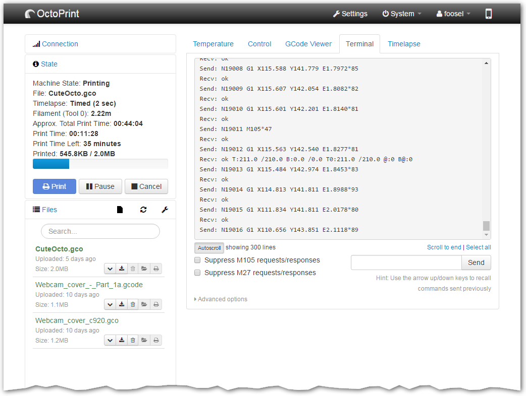
This screenshot of OctoPrint web UI, showing their “terminal” tab looks promising. We’ll probably want something similar to the terminal for diagnostics and viewing the raw messages as they go back and forth.
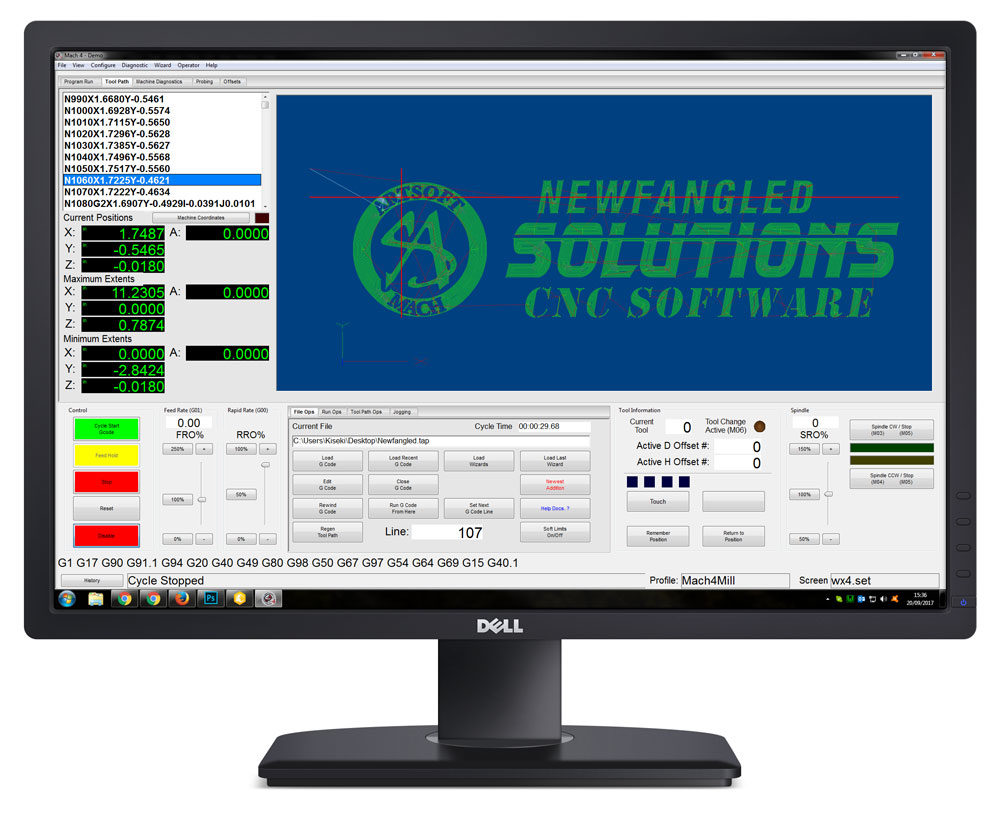
Another example, more machine-oriented this time, is Mach4. This is a commercial desktop program commonly used to control CNC machines.
Another option is the highly configurable LinuxCNC.
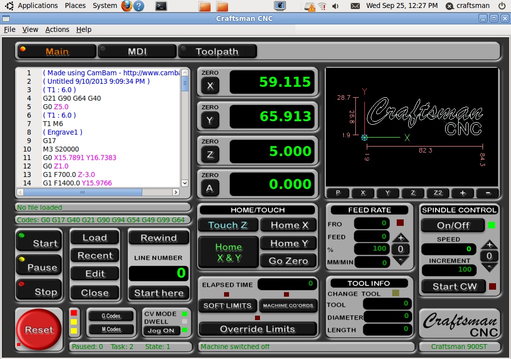
Some elements they all have in common:
- Lots of numbers and buttons, preferring functionality over aesthetics
- Some sort of pseudo-text editor for viewing the program sent to the machine
- Instantaneous axis positions
- Buttons for triggering various automation sequences
- Colours which indicate whether things are “happy” (or not) at a glance
- A 3D preview which shows how the job might look when cut
I’m personally leaning towards the OctoPrint example. It’s rather clean, and the UI layout/behaviour fits well in a browser (probably not surprising, considering it’s a web UI).
Implementation Link to heading
We’re going to lean heavily on Bootstrap and BootstrapVue for the CSS and UI elements here, so add them as a dependency.
yarn add vue bootstrap-vue bootstrap
We’ll also need to import the CSS and register the BootstrapVue plugin.
// frontend/src/main.ts

import Vue from 'vue';
import BootstrapVue from 'bootstrap-vue';

import App from './App.vue';

import 'bootstrap/dist/css/bootstrap.css';
import 'bootstrap-vue/dist/bootstrap-vue.css';

Vue.use(BootstrapVue)

...
The next step is to mock out the various UI elements. This part can take a while, especially if you aren’t a normally frontend developer (like me!).
After some tweaking, I came up with this:
If you want to see all of the code that went into that frontend, it’s all on GitHub. You’ll want to start around commit 24ca65c7).
This design has roughly two areas, the Sidebar and Body.
The Sidebar is given its own component containing information which you’ll want to see at a glance. This includes things like the current machine state (axis positions, limit switches, etc.) and an overview of the simulator (FPS, job upload progress, etc.).
The frequency and tick_duration_us are passed down from App as props. That
way whenever they get updated on the App, the new values will be automagically
passed down to the Sidebar and trigger a redraw.
Rendering is just a case of tweaking the Accordian example from BootstrapVue’s website. Axis positions aren’t actually recorded anywhere, so we’ll use dummy values for the moment.
// frontend/src/components/Sidebar.vue

<template>
  <div class="sidebar" role="tablist">
    <b-card no-body class="mb-1">
      <b-card-header header-tag="header" class="p-1" role="tab">
        <b-button block href="#" v-b-toggle.accordion-1 variant="info">Overview</b-button>
      </b-card-header>
      <b-collapse id="accordion-1" visible accordion="my-accordion" role="tabpanel">
        <b-card-body>
          <table class="table">
            <tr>
              <td>FPS</td>
              <td>{{frequency}} Hz <small>({{tick_duration_us}} μs)</small></td>
            </tr>
          </table>
        </b-card-body>
      </b-collapse>
    </b-card>

    <b-card no-body class="mb-1">
      <b-card-header header-tag="header" class="p-1" role="tab">
        <b-button block href="#" v-b-toggle.accordion-2 variant="info">Current State</b-button>
      </b-card-header>
      <b-collapse id="accordion-2" accordion="my-accordion" role="tabpanel">
        <b-card-body>
          <table class="table">
            <tr><td>X</td><td>123</td></tr>
            <tr><td>Y</td><td>321</td></tr>
            <tr><td>Z</td><td>456.7</td></tr>
          </table>
        </b-card-body>
      </b-collapse>
    </b-card>
  </div>
</template>
The bulk of the page is filled with the Body. This contains a set of tabs (may or may not be copied from BootstrapVue’s tabs example) with a couple useful panels.
First, as the way a user interacts with the motion controller it makes sense to have a Control panel. This will contain buttons for sending various commands or setting values (e.g. calibration ratios) but for now it’ll just have an input for triggering the Home automation sequence, and a field for setting the homing speed.
Again, this gets pulled out into its own component. We make use of the @Emit
decorator to emit a "home" event whenever the Home button is pressed. The
event’s payload contains the homing speed (in mm/s) and will be used by the
App later on to send a message to the motion controller.
Other than that, it’s fairly similar to what you may see in the Vue tutorial or BootstrapVue’s inline form example.
// frontend/src/components/Controls.vue

<template>
  <div>
    <b-form inline @submit="onHomePressed">
      <label class="sr-only" for="homing-speed">Homing Speed</label>
      <b-input-group append="mm/s" class="mb-2 mr-sm-2 mb-sm-0">
        <b-input
          type="number"
          step="0.01"
          min="0"
          id="homing-speed"
          v-model.number="motion.homingSpeed"
        ></b-input>
      </b-input-group>

      <b-button type="submit" variant="primary">Home</b-button>
    </b-form>
  </div>
</template>

<script lang="ts">
import { Component, Vue, Emit } from "vue-property-decorator";
import MotionParameters from "../MotionParameters";

@Component
export default class Controls extends Vue {
  public motion = new MotionParameters();

  onHomePressed(e: Event) {
    e.preventDefault();
    this.home();
  }

  @Emit()
  home() {
    return { speed: this.motion.homingSpeed };
  }
}
</script>
The GCodeViewer itself is almost trivial. It’s essentially a component which
is passed a text property and will display it. Whitespace is important when
viewing a g-code program so we use <pre> and <code> tags to render the text
line-by-line.
// frontend/src/components/GCodeViewer.vue

<template>
  <div>
    <pre><code v-for="(line, i) in lines" :key="i">{{line}}<br /></code></pre>
  </div>
</template>

<script lang="ts">
import { Component, Vue, Prop } from "vue-property-decorator";

@Component
export default class GCodeViewer extends Vue {
  @Prop({ type: String, default: "" })
  public text!: string;

  public get lines(): string[] {
    return this.text.split("\n");
  }
}
</script>
Other than that, implementing the GCodeViewer is just a case of playing with
CSS until it looks like a proper editor.
The final tab (and last major component) is the Terminal, a component we’ll
become quite familiar with when troubleshooting communications problems. The
general idea is the Terminal will have a list of messages that have been
recently sent or received, and will render them using a v-for and a
MessageViewer helper.
For now the Terminal is quite minimal, but later on it’ll also include buttons
and fields for manually sending messages to the motion controller.
// frontend/src/components/Terminal.vue

<template>
  <div class="console">
    <MessageViewer v-for="(msg, i) in messages" :key="i" :msg="msg" />
  </div>
</template>

<script lang="ts">
import { Component, Vue, Prop } from "vue-property-decorator";
import MessageViewer from "@/components/MessageViewer.vue";
import { Message, areMessages } from "../Message";

@Component({ components: { MessageViewer } })
export default class Terminal extends Vue {
  @Prop({ required: true, default: () => [], validator: areMessages })
  public messages!: Message[];
}
</script>
The Message itself is almost trivial:
// frontend/src/Message.ts

export interface Message {
    direction: Direction;
    timestamp: Date;
    toString(): string;
}

export enum Direction {
    Sent = 1,
    Received = 2,
}
Likewise, the MessageViewer helper is just a widget for displaying Messages.
It’ll print the direction (using a unicode arrow), timestamp, and a string
representation. Later on we may also add the ability to double-click on a
message to show a more detailed JSON representation.
// frontend/src/components/MessageViewer.vue

<template>
  <div class="message" :class="style">
    <span class="direction">{{arrow}}</span>
    <span class="timestamp">{{timestamp}}</span>
    <pre>{{msg.toString()}}</pre>
  </div>
</template>

<script lang="ts">
import { Component, Vue, Prop } from "vue-property-decorator";
import { Message, isMessage, Direction } from "../Message";

@Component
export default class MessageViewer extends Vue {
  @Prop({ required: true, validator: isMessage })
  public msg!: Message;

  public get timestamp(): string {
    return this.msg.timestamp.toISOString().replace("T", " ").replace("Z", "");
  }

  public get arrow(): string {
    switch (this.msg.direction) {
      case Direction.Sent:
        return "▶";
      case Direction.Received:
        return "◀";
    }
  }

  public get style(): string {
    switch (this.msg.direction) {
      case Direction.Sent:
        return "sent";
      case Direction.Received:
        return "received";
    }
  }
}
</script>
As well as using a message class for styling the component as a whole,
we’re taking advantage of computed styles to dynamically mark a
particular message as send or receive. This allows us to use colour to
differentiate between the message direction.
The Next Step Link to heading
So far we’ve built a Communications system, a Motion system and automation routines, and we’ve stubbed out the User Interface. For a change, instead of spending the entire time in the bowels of our Rust motion controller code, we jumped back up the stack and wrote a big chunk of the user-facing frontend.
This isn’t uncommon when working in smaller teams. Often implementing a feature will require adding a bunch of low-level logic to the embedded system, then jumping over to the frontend code to make sure the various buttons, knobs, and levers are accessible to the user.
Our next job will be to make sure the UI and motion controller can pass messages to each other. Hopefully once the two halves of our simulator can communicate we can start adding new functionality and begin to feel the productivity boost associated with our earlier infrastructure work (generalised message handling, the decoupling of systems from each other and the larger application, etc.).